The psychology of colour in web design and branding is something that influences us daily without realising it. How often do you choose a new item based on its colour or buy a particular product simply because of the branding? Studies show that colour alone can influence buying power by up to 85%. In this article, we will be exploring in more detail the power of colour psychology and how you can use it in your branding and web design.
What is colour psychology?
The choice of colour can be powerful for a brand, and colour psychology is the study of how colour affects people’s perceptions and behaviours. In the marketing and branding world, colour psychology focuses on how specific colours impact a customer’s impressions or buying habits and whether or not companies can use particular colours to persuade or influence customers to buy certain products.
Why is it important for Web Design?
We are all familiar with the yellow arches of MacDonald’s, the red can for Coca Cola or a purple bar of Cadbury’s chocolate – and there is a reason that brands stick to their trademark of familiar colour schemes. Studies show that people judge your content in 90 seconds or less, and colour helps customers recognise a brand by up to 80%. So having an instantly recognisable colour scheme or one that catches people’s attention may help your business to generate more customers.
It’s vital with any business that you have a recognisable brand that gives off the correct ‘image’ for your target audience. Research shows that specific colours can affect people’s moods positively or negatively. For example, blue may make you feel calm, pink is usually associated with love and romance, and yellow usually makes people feel happy (but sometimes it can do the opposite and increase feelings of frustration).
Web design is the ultimate multitasker; it must look great, provide clear navigation for users, hold customers’ attention, and slowly push them towards the product the business wants to sell. And this is where the psychology of colour comes in for web design – more and more web designers are utilising its selling potential to translate into more customers or sales.
Contrast and Brightness.
It’s not just the specific colour that can affect your spending habits and mood – the brightness of the colour can further play a role in the success of your website or branding. Research has indicated that men generally prefer brighter colours and women softer hues. In addition to this, contrast plays a significant role in web design , as it helps to highlight important parts of the website and encourages customers to focus on those areas.
But, the key is to use contrast effectively – overusing contrasting colours or designs could result in confusing or harsh looking websites. Using it sparingly for the key areas you want to draw customers to will effectively direct users to the correct part of the website.
Colours and their meanings.
And of course, the main question is: what colours should I use?
The infographic from a HuffPost article below shows how the biggest companies use colours from a branding perspective and common colour associations that you can use when helping you make a decision:
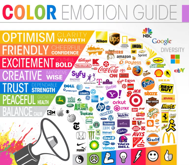
Pink: pink is a great colour to use if you are marketing towards a more feminine audience, as studies show that pink raises feelings of fun, romance, and youthfulness emotions.
Blue: the colour blue gives off an impression of coolness, trustworthiness and dependability. It’s a very calming colour. This is a colour often used by companies who want to give off a very dependable and ‘serious’ image.
Green: green is associated mainly with peacefulness, nature and growth. Lighter greens may be linked more to nature, spring and growth, whereas people usually connect darker greens to money.
Yellow: yellow represents happiness and optimism as it is an energising colour. Advertisers often utilise yellow when advertising to children, as it grabs their attention.
Orange: orange is another attention-grabbing colour that represents cheerfulness and indicates creativity and confidence as it is a unique and exciting colour.
Red: Red is the best colour if you want to create an impact, as it is associated with boldness and confidence. It’s one of the most effective colours to use with ‘call to action buttons. But, it can also be associated with danger or anger.
Purple: purple is another creative colour and is often used with brands that project elegance and sophistication.
Grey: grey is a very neutral colour to use in marketing and branding and is generally a very neutral and calming colour.
How can I use colour psychology to my advantage?
When deciding which colours to use for your branding and web design, the first step is to consider your target audience and the image you want to ‘project’. It is crucial to always keep in mind whether the colour fits with what you are selling.
Whether the branding and colours you have chosen fit with your product is known as ‘perceived appropriateness’, with a study from 2006 showing how an appropriately selected colour for a logo can immediately increase the brand’s value to customers. Therefore, it can be worth conducting market research before you finalise the colour scheme for your brand to see if it fits well with the product you are marketing.
Once you have your colour scheme locked in, you can then focus on using colour and contrast to highlight the critical areas on your page. Key areas to consider include:
- Images;
- Pop-ups;
- Borders;
- Headlines;
- Background hues;
- Primary web banners or hero graphics;
- Buttons (call for action).
By highlighting these key areas, you will be gently nudging your clients in the direction of the product that you want to sell.
Potential issues with colour psychology.
Although your business can use the concept of colour psychology when deciding on a colour scheme, it is essential not to place all of your focus on this one area. The truth is that although studies indicate that it can positively help your business, colour is still too dependant on personal experience and taste for there to be one definitive answer.
So, although colours may invoke a slight psychological reaction, customers are naturally drawn to the colours they like, which won’t be the same for everyone. Therefore, the real key is to ensure that the colours best represent the image and brand you are aiming to project and fit with the product you are trying to sell.
For further information on how we can help you refresh your brand or website with a new look, visit our website and services page today!

